When “AI” shows up at work, people brace for impact.
Clinicians already carry enough cognitive load inside an EHR. Adding an AI assistant doesn’t automatically help. It can just as easily introduce distraction, doubt, and one more thing to manage. Robin was designed to do the opposite: offer support that feels calm, contained, and trustworthy without pulling clinicians out of their workflow.
Client
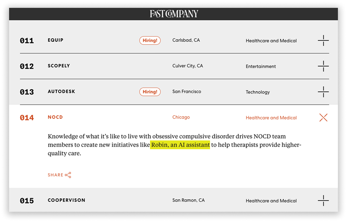
NOCD (mental-health tech platform)
Role
Lead Product Designer
Team
Product, Clinical Ops, Engineering
Scope
Dashboard UX, UI, visual tone, copy direction
The problem wasn’t answering questions. It was earning belief.
The Problem
Clinicians need more than a responsive virtual assistant. They need one they can trust inside a space filled with confidential information, sensitive workflows, and privacy risk. If the assistant felt unclear, intrusive, or overly “AI-ish,” adoption would stall before it started. Common concerns weren’t abstract:
“Is this recording anything?”
“Where is this information going?”
“What’s being stored and who can see it?”
“Will this get in the way of actual clinical work?”
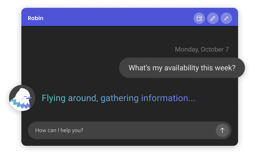
The solution: help that feels present, not intrusive.
A simple rule: support should feel contained.
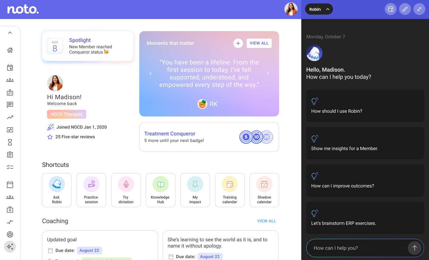
We treated Robin less like a feature and more like a presence—embedded directly into the EHR so clinicians could ask, scan, and continue without context switching. The experience was designed to be:
Embedded: help appears where the work happens
Predictable: interaction patterns behave the same way every time
Restrained: minimal visual noise, minimal theatrics
Transparent: clear cues for feedback, history, and system behavior
When the assistant is calm, the clinician
stays calm.
The UI was built around interaction patterns that reduce uncertainty, because uncertainty is where distrust grows.
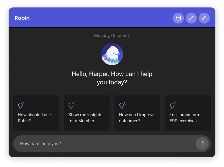
Conversational entry points that guide people toward safe, common tasks
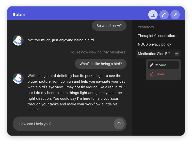
Useful chat history designed as a reference, not a transcript dump
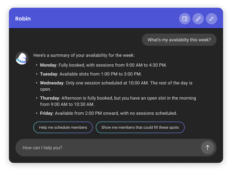
Progressive disclosure that surfaces answers and prompts a natural next step
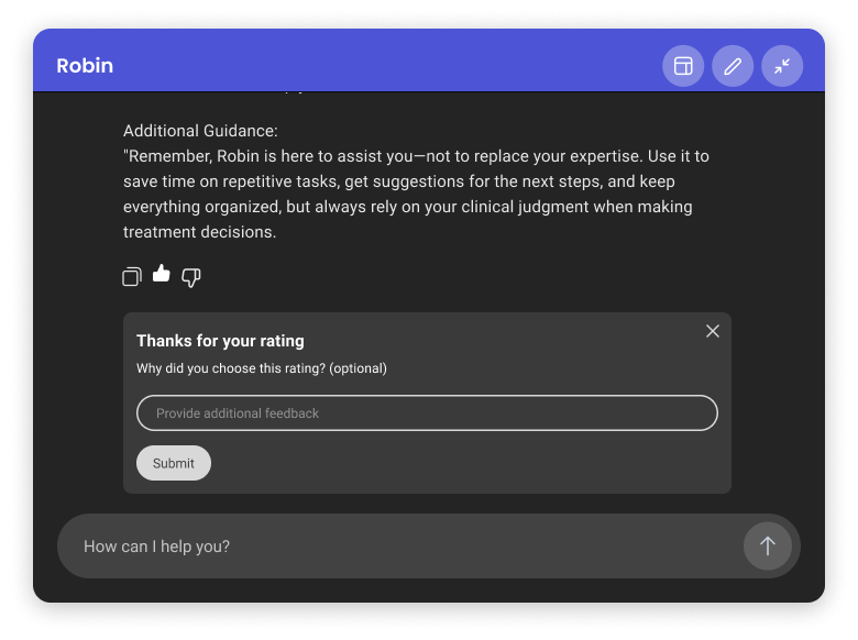
Clear feedback loops rating responses, errors, “what happened?” states
Trust doesn’t stop at the interface.
AI raised real questions around privacy, accuracy, and control. These were questions UI alone couldn’t answer.
To support adoption, I designed an internal intranet page that gave clinicians a low-pressure way to understand how the tool worked, explore it before using it in sessions, and connect directly with the tech team if they had concerns. The focus wasn’t persuasion, but clarity: what the assistant does, what it doesn’t do, and who’s behind it.
Trust was built through transparency, not hype.
The bird wasn’t ornamental. It was intentional.
A purely utilitarian assistant can feel like surveillance. A too-playful one can feel unserious. Robin needed something else: a recognizable identity that signaled support without adding pressure.
The character did the work of softening first contact, setting a consistent human tone, and creating presence without implying authority. It helped the experience feel intentionally designed rather than bolted on, giving clinicians something they could recognize, trust, and return to.
The visual system was designed to scale, with full-color and reduced two-color versions that worked across in-product moments and future touchpoints without losing clarity.

An AI experience designed to stay in its lane.
The Response
Robin landed as a usable, production-ready layer within the EHR by supporting clinicians across day-to-day tasks. More importantly, it was designed to meet adoption head-on: by reducing friction, dialing down “AI theater,” and using brand-aligned tone and identity cues to make trust easier.
This work was part of a broader proprietary EHR platform and was mentioned in Fast Company for its approach to applied AI in behavioral health.
Sometimes the most important feature is reassurance.
When support feels predictable, contained, and human, people don’t have to think twice about using it.