Come for the tea, stay for the intuition.
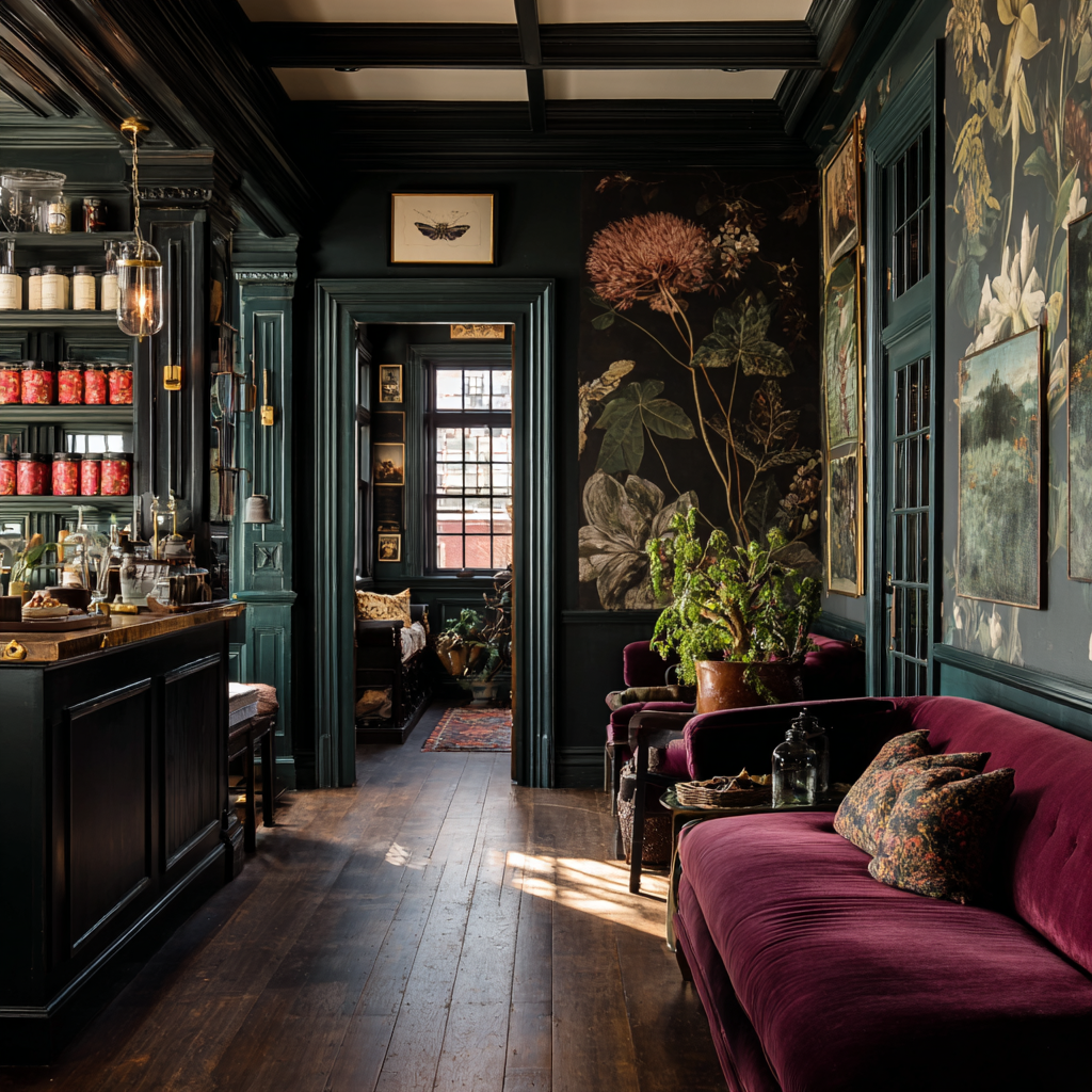
Hush is a conceptual brand identity for an intimate tea room offering loose-leaf teas alongside private intuitive sessions. Designed as a small, cozy space in coastal New England, the project explores how branding can support slow rituals — whether that means ordering a cup of tea, settling into a corner, or booking a quiet, reflective experience.
This self-initiated project was created to explore atmosphere-led branding, physical space considerations, and the balance between approachability and mysticism in hospitality design.
the challengeHolding two experiences within one identity.
The goal of Hush was to design an identity capable of holding two complementary experiences at once. The tea room brand needed to support more introspective offerings without drifting into novelty or theatricality. The challenge was to design a system that:
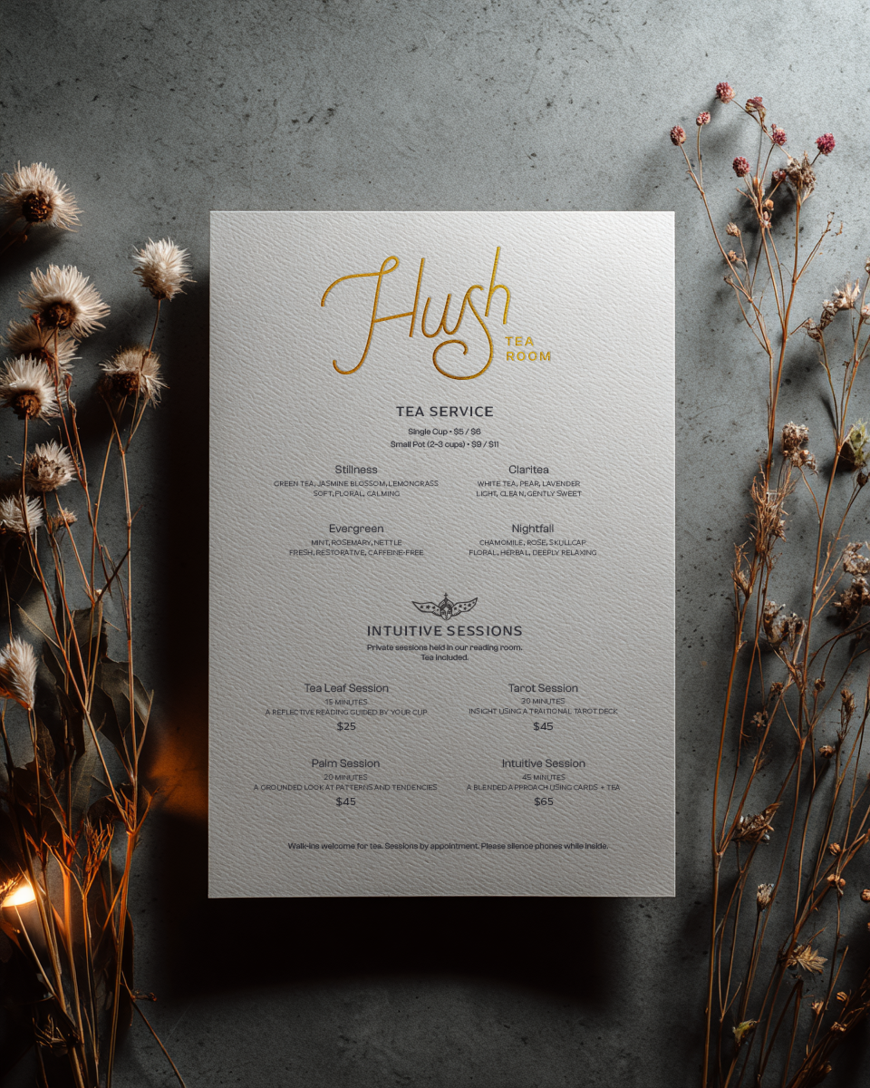
clearly communicates both tea service and intuitive offerings
feels intimate and human at a small physical scale
draws from historical references without appearing antique or costume-like
translates cohesively across menus, packaging, merchandise, and interiors

THE APPROACHAn identity shaped by space, scale, and restraint.
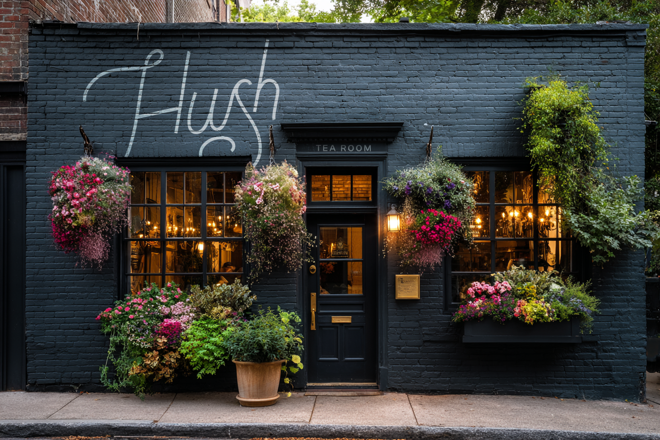
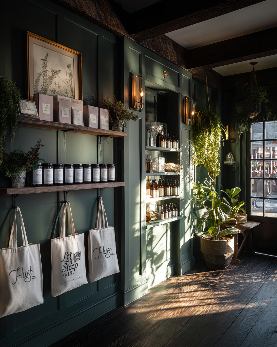
I approached Hush as a holistic identity system, designed to live across physical space, print, and small ritual objects. The work emphasized restraint, allowing typography, materiality, and spacing to set the tone, with botanical references used sparingly to support the atmosphere.
Exploration drew from old-world apothecary cues, coastal New England interiors, and jewel-toned palettes grounded by charcoal and moss. Throughout, decisions were guided by scale, realism, and usability, ensuring the system felt tactile, intimate, and believable in use.
System + ApplicationHeld together by tone and texture.
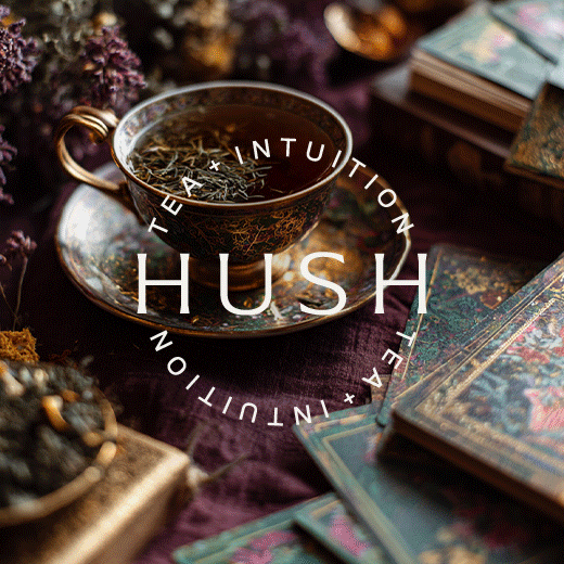
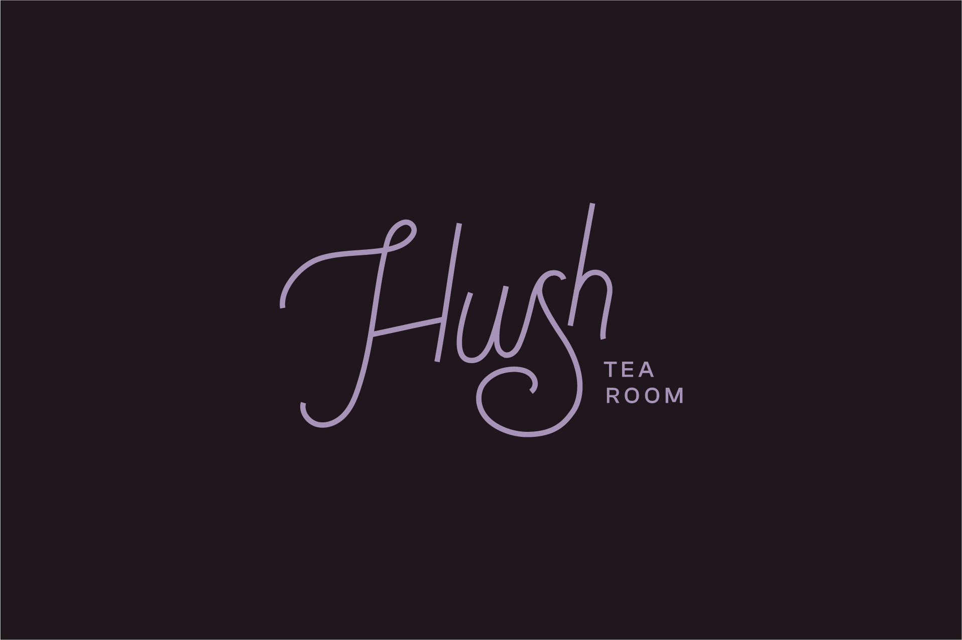
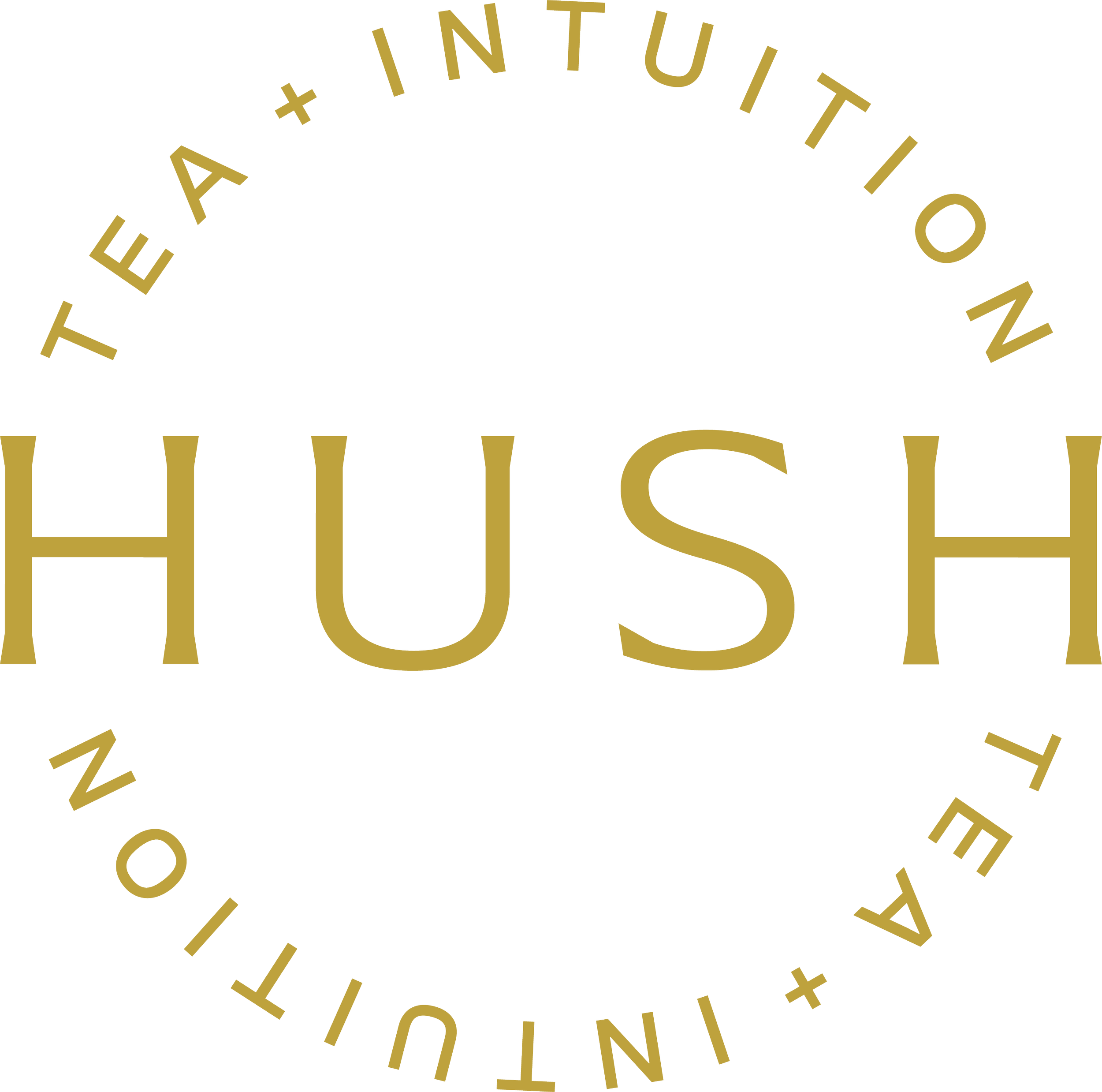
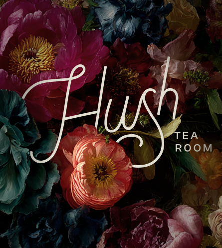
Primary wordmark
A quiet, character-driven logo designed to feel confident without dominance.
Secondary mark
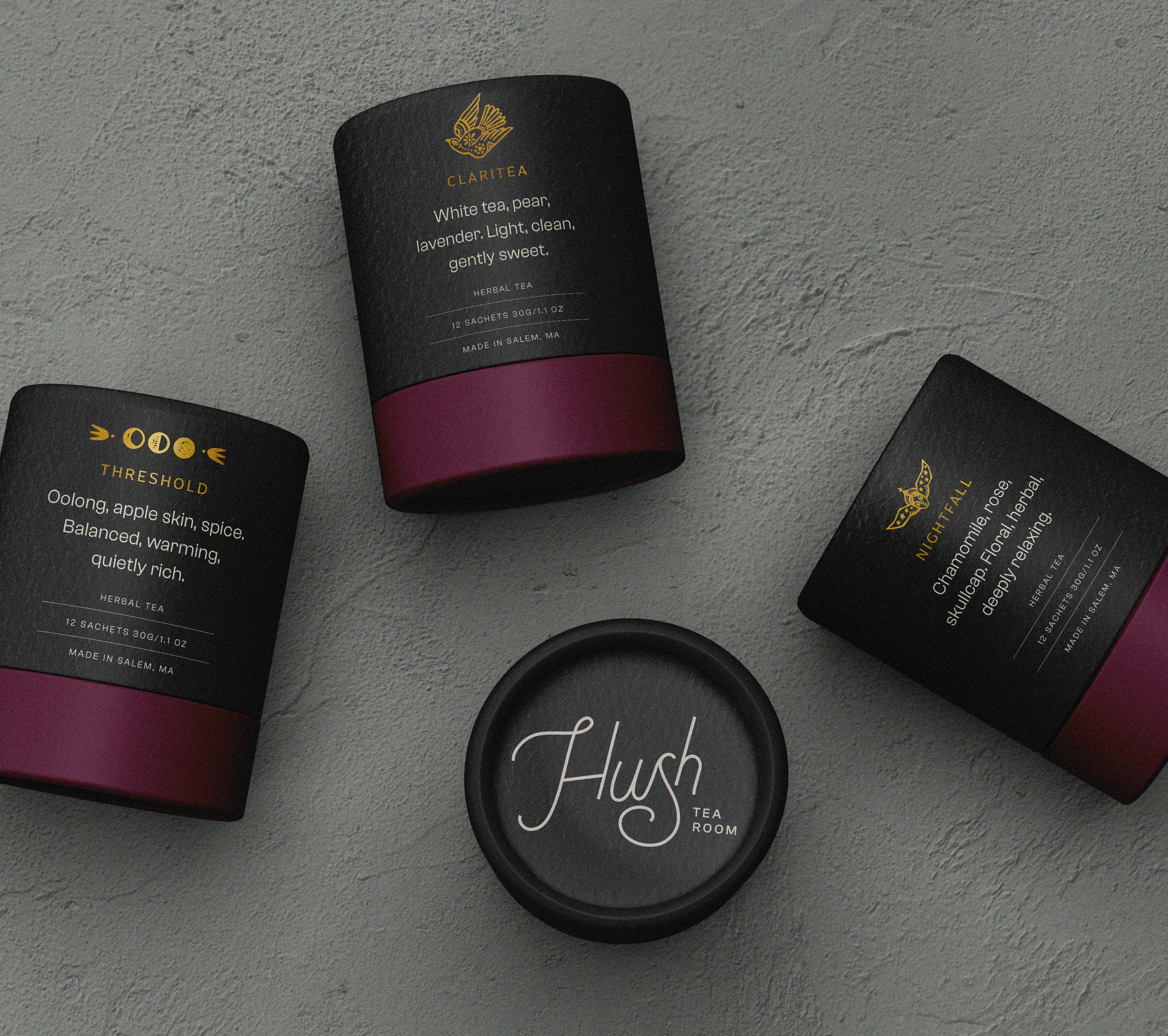
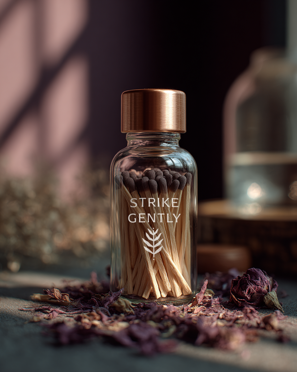
A simplified supporting symbol intended for small-format applications such as coasters, matchboxes, and packaging accents.
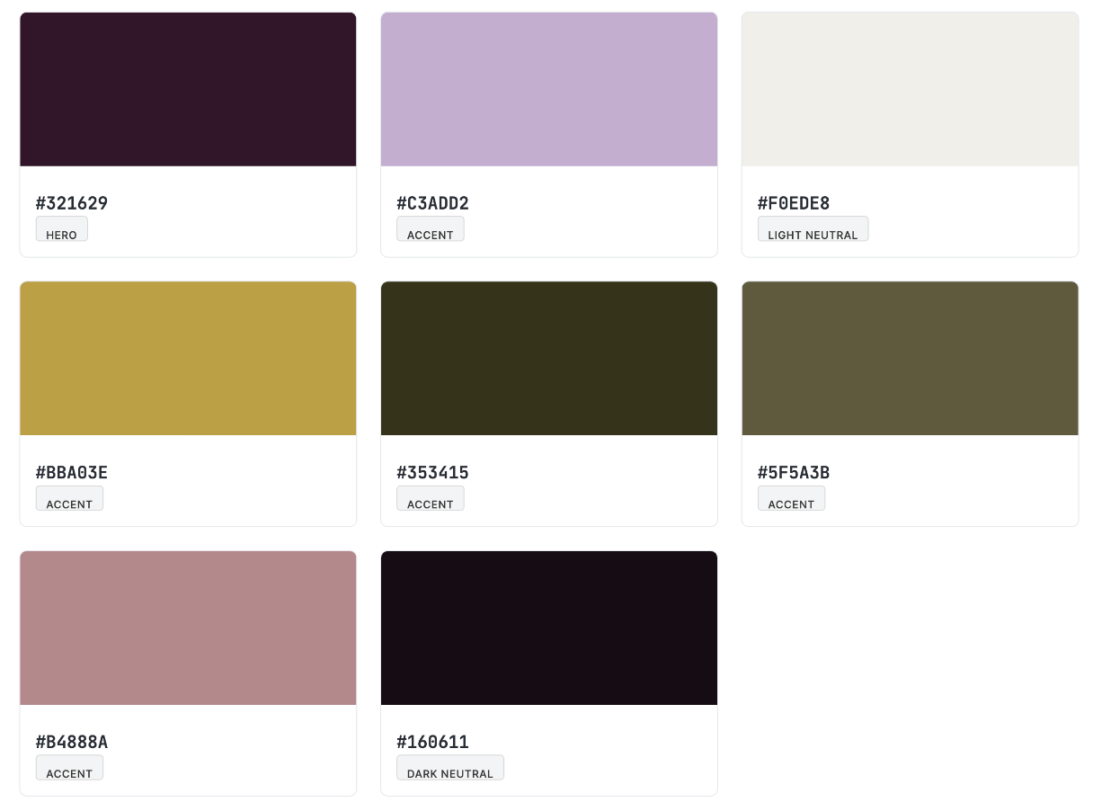
Color palette
A restrained jewel-tone palette inspired by botanicals, dusk, and natural materials.
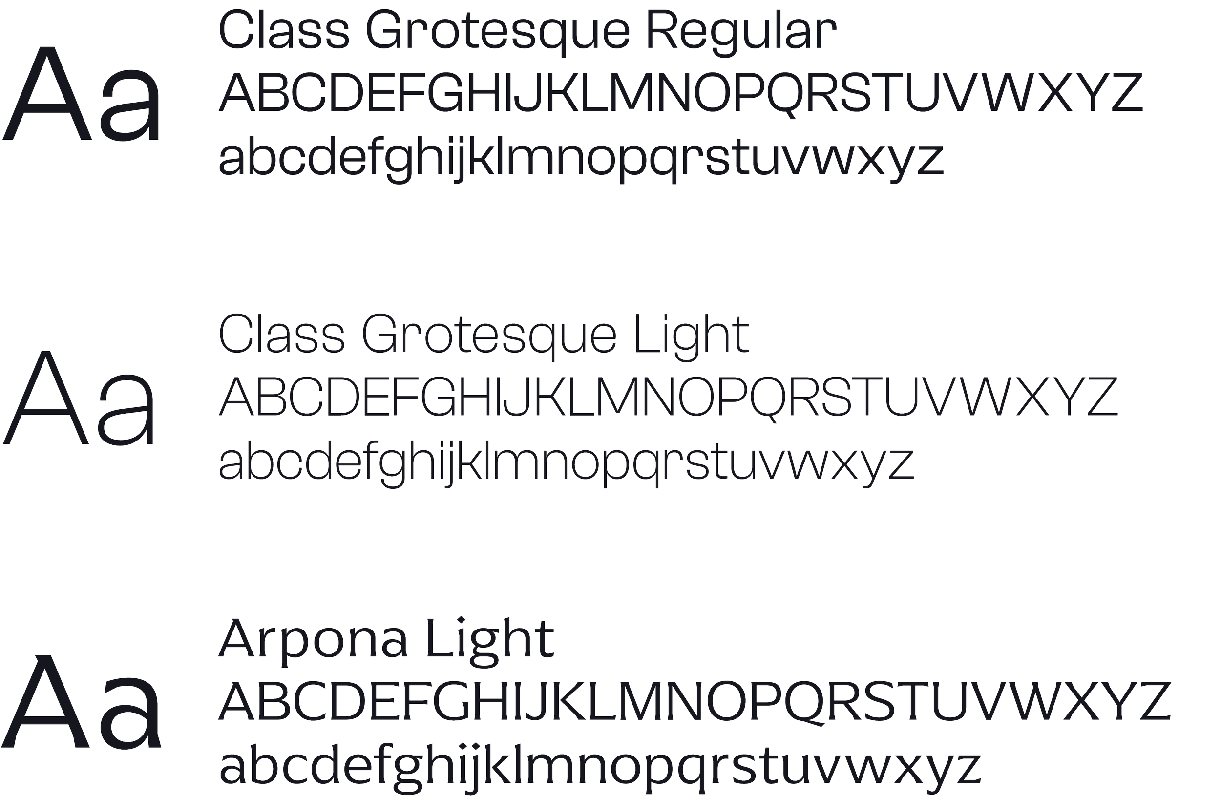
Typography
An editorial type system balancing historic influence with modern clarity.
Micro-illustrations
A small set of reusable icons was sourced, referencing ritual and intuition.
Applications
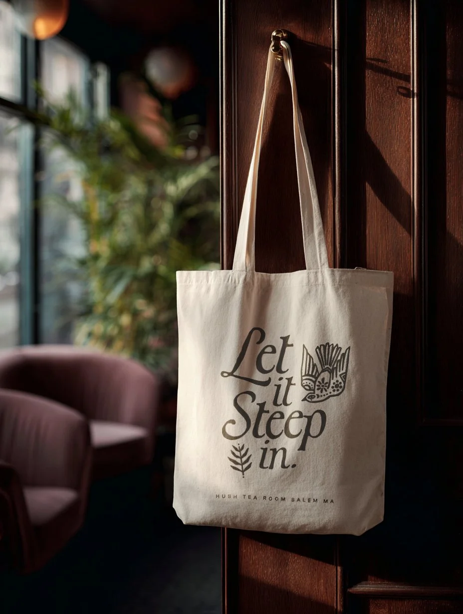
Concept designs for menus, tea packaging, matchboxes, coasters, tote bags, and reading materials were developed to test the flexibility and cohesion of the system.


OutcomeQuietly cohesive, intentionally human.
Hush demonstrates how a thoughtfully restrained identity system can support both everyday hospitality and more reflective experiences within a single brand.
As a conceptual project, it allowed for deeper exploration of atmosphere, materiality, and scale. This exploration resulted in a cohesive, tactile system designed to feel believable, intimate, and quietly confident across touchpoints.